Extra Credit: Dark Mode (Toggle)
Dark Mode is often times the most requested feature in any product, despite being a totally "cosmetic" addition. It offers both offers no functionality, and am improved user experience beyond most other fixes. While the phrase dark mode has become a verbal shorthand to refer to a specific color palette and UI paradigm, it holds many other connotations. In this exercise you'll make a simple prototype of a toggle switch using Protopie, then experiment with your interpretation of what "Dark Mode" can mean.
Resources
Protopie
Protopie Player (iOS)
Protopie Player (Android)
Files
- Sample Figma file
- Protopie Sample Prototype (will update later)
Instructions
- Sign up for Protopie. Install Protopie on your computer and log in.
- Install the Protopie Plugin on your mobile device (iOS)
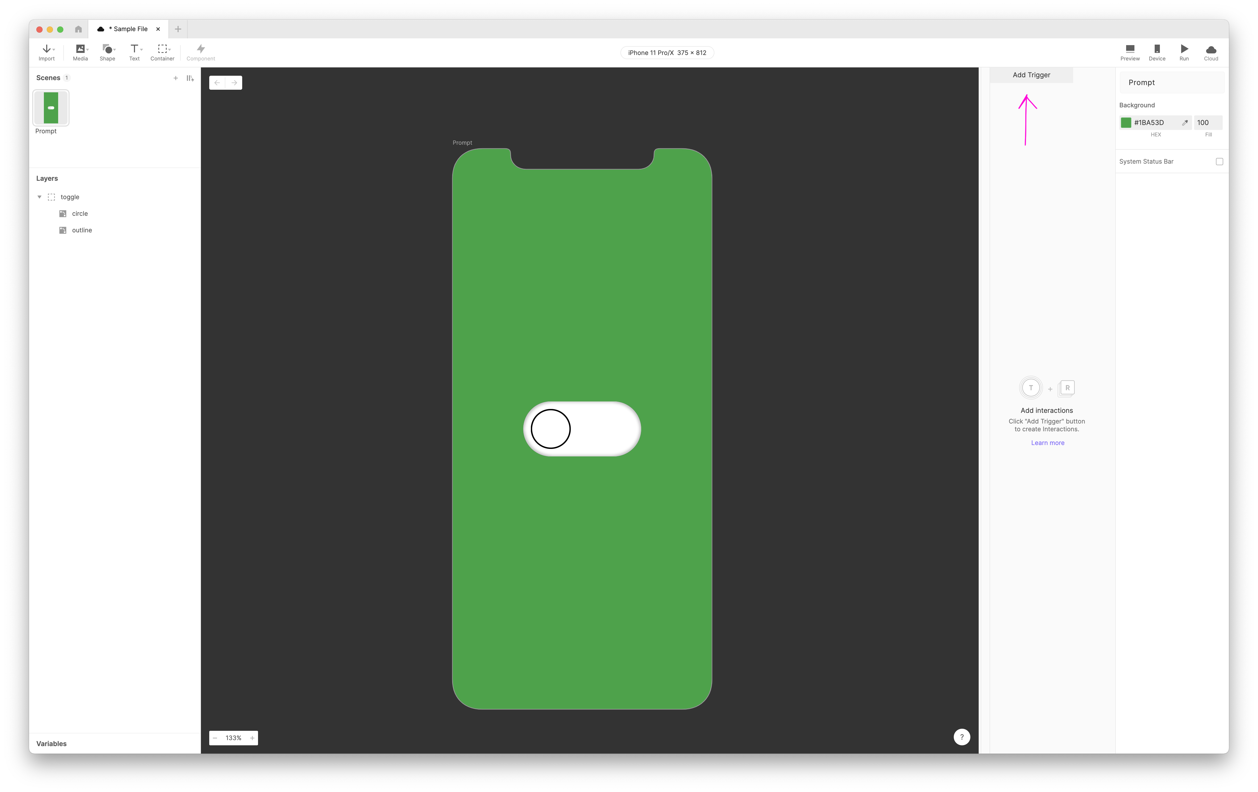
(Android). - Using this sample Figma file as a base, import the
promptframe into Protopie. - Add a
tapTrigger to thetoggleobject, to make the toggle switch turn on and off. To do this, you'll move thecirclealong theXaxis based on acondition. (for a step-by-step explanation of how to do this, scroll to the bottom of this webpage, and reference the file from today's demo. - After adding your toggle, consider what a 'light' and 'dark' mode indicates beyond how we traditionally think about it. Does a light mode feel airy and breezy, where a dark mode feels sinister? In dark mode do the language prompts in your UI change to sound scary (are they read by a voice?)? Does light and dark mode control a representation of a light, or the position of the sun in the sky (in an illustration)?
- Experiment with what dark mode can mean, and share a link to your prototype in the class Google doc.
References
How to Create a Toggle
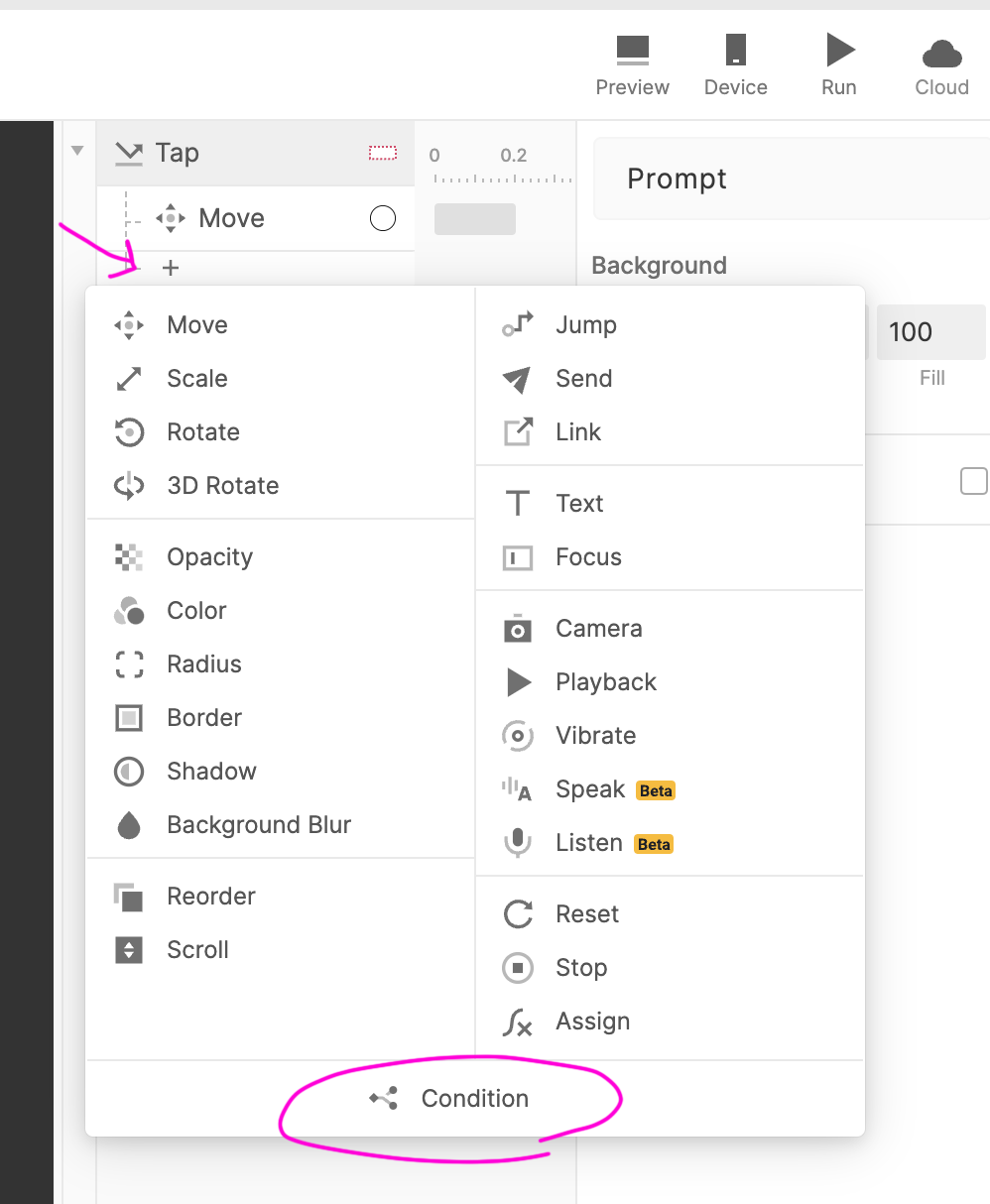
- Select the
toggleobject and add Trigger to it by clicking the button in the righthand side of the UI
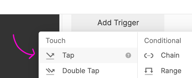
- Choose
tapfrom the menu. In the right most menu, make sure thetoggleobject is selected as it will be your tap target.

- Add a Response by clicking the
+sign under thetapTrigger, and select move.
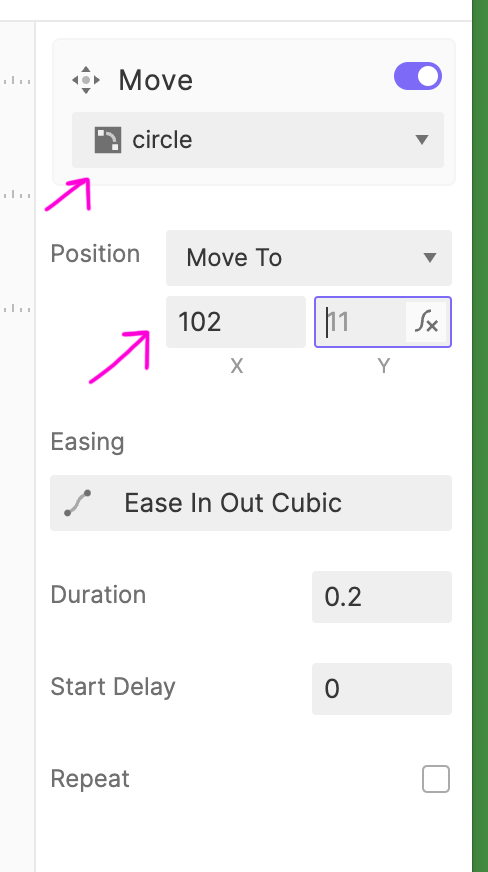
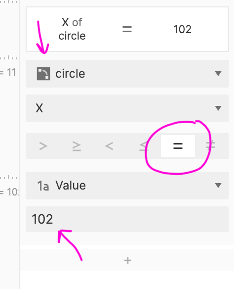
- Select the
circleunder the move response, and set itsxvalue to102. Now if you preview your prototype, you will see the toggle switch move!
- However, you also want to set the Toggle to return to its original position. To do this, we'll set a condition as a Reponse to the
tap. Underneath the sametapTrigger add another Response, this time selectingcondition.
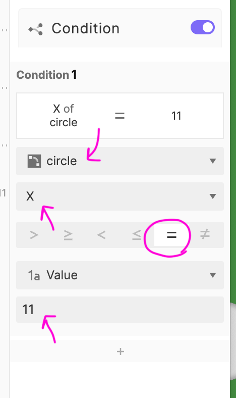
- For your condition, make sure the
circleis selected, and make the condition true if thevalueequals11.
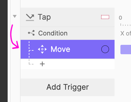
- Drag your move action underneath the condition in the righthand panel. Now if the
conditionyou set is true, the circle will move into the correct position (it will look the same!).
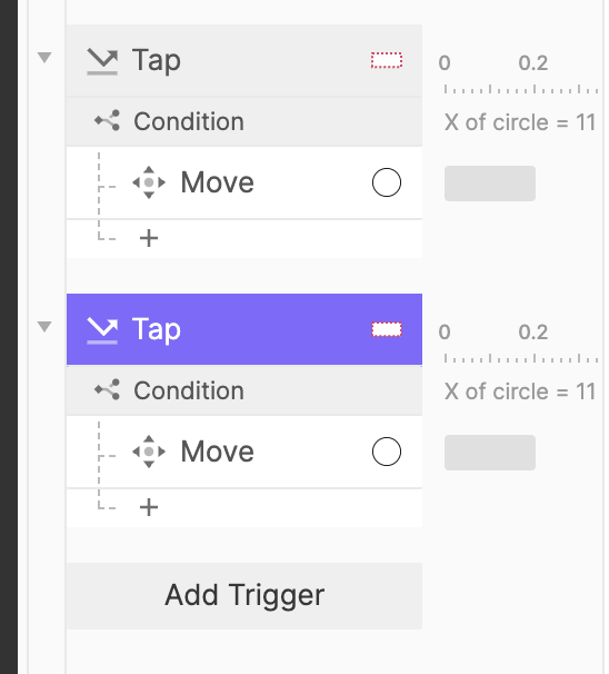
- Now we'll want to make the toggle go back to its original position again. Copy and paste the entire
taptrigger, and adjust the Response.
- First, set your condition, with the
circleselected, to true if thevalueequals102.
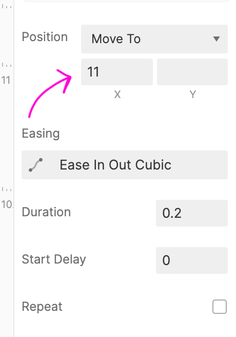
- Then, adjust the move Response to set the
circlexvalue to11. If everything was done correctly you should have a functioning toggle switch!