Extra Credit: HTML Wireframes
A website wireframe, also known as a page schematic or screen blueprint, is a visual guide that represents the skeletal framework of a website... The wireframe depicts the page layout or arrangement of the website's content, including interface elements and navigational systems, and how they work together. The wireframe usually lacks typographic style, color, or graphics, since the main focus lies in functionality, behavior, and priority of content.
– Wikipedia
To gain an understanding of traditional web layouts, we'll recreate a simplified version of a popular website as an HTML and CSS "wireframe". While we have already created wireframes for our own designs in software such as Figma, by taking it one step further and attempting the practice in a browser window adding the interaction of scroll we can gain useful insights into HTML coding.
For this exercise we will focus on creating an HTML wireframe for an existing webpage with a specific screen size in mind.
Instructions

- Select a website of your choice, and take a screenshot (take note of the window size).

- Trace the webpages "primary" layout elements. It's up to you how detailed you want to be with your tracing, but I would suggest focusing on the "sections" of the page, and not get into the details of any specific item on the page.
- Using HTML and CSS, recreate your wireframe in the browser window. Pay attention to the semantics and nesting of your code. For instance, elements such as
main,nav, andsidebar, indicate where they may appear in a layout, while also communicating to screenreaders making your site more accessible. Their use can also indicate where you would "nest" content inside of them, and patterns about how your HTML elements may be arranged.
To construct your wireframes, the following CSS properties will be helpful:
position
Position can have several values, I would suggest looking at:
position: absolute;
position: fixed;
position: sticky;
to place elements on the page and give them the behavior you are hoping for.
display
We've already talked about the difference between block and inline display elements, but grid and flex are two useful display methods for arranging items on the page. Grid enables you to create a grid, while Flexbox, allows you to position html elements in a more flexible way.
The following for instance, would align all items inside of the main element directly to the center of the page:
main {
  display: flex;
  justify-content: center;
  align-items: center;
  flex-direction: column;
}
And the following creates a 3 column grid inside of the div with the id grid:
#grid {
  display: grid;
  grid-template-columns: 1fr 1fr 1fr;
  grid-gap: 20px;
}
to adjust the height and width of your elements, I'd recommend looking into CSS units. In particular vw (viewport width), vh (viewport height), and calc() which allows you to calculate a static value combined with dynamic ones. Some example uses:
width: 100vw;
/* takes up the whole viewport's width */

height: 50vh;
/* takes up the 50% of the viewport's height */

width: calc(100vw - 40px);
/* takes up the 100% of the viewport's width minus 40px */
Lastly, to make the wireframe's appearance I would suggest giving HTML elements a border of 1px solid black and adjusting border-radius.
- Upload and link your wireframe from your personal website.
Note: I'd recommend making your wireframe for one screensize. HTML/CSS layout is flexible, but you will often need to employ CSS Media Queries and "Breakpoints" to make your website flexible enough to work seamlessly across devices. We'll learn more about this soon!
Resources
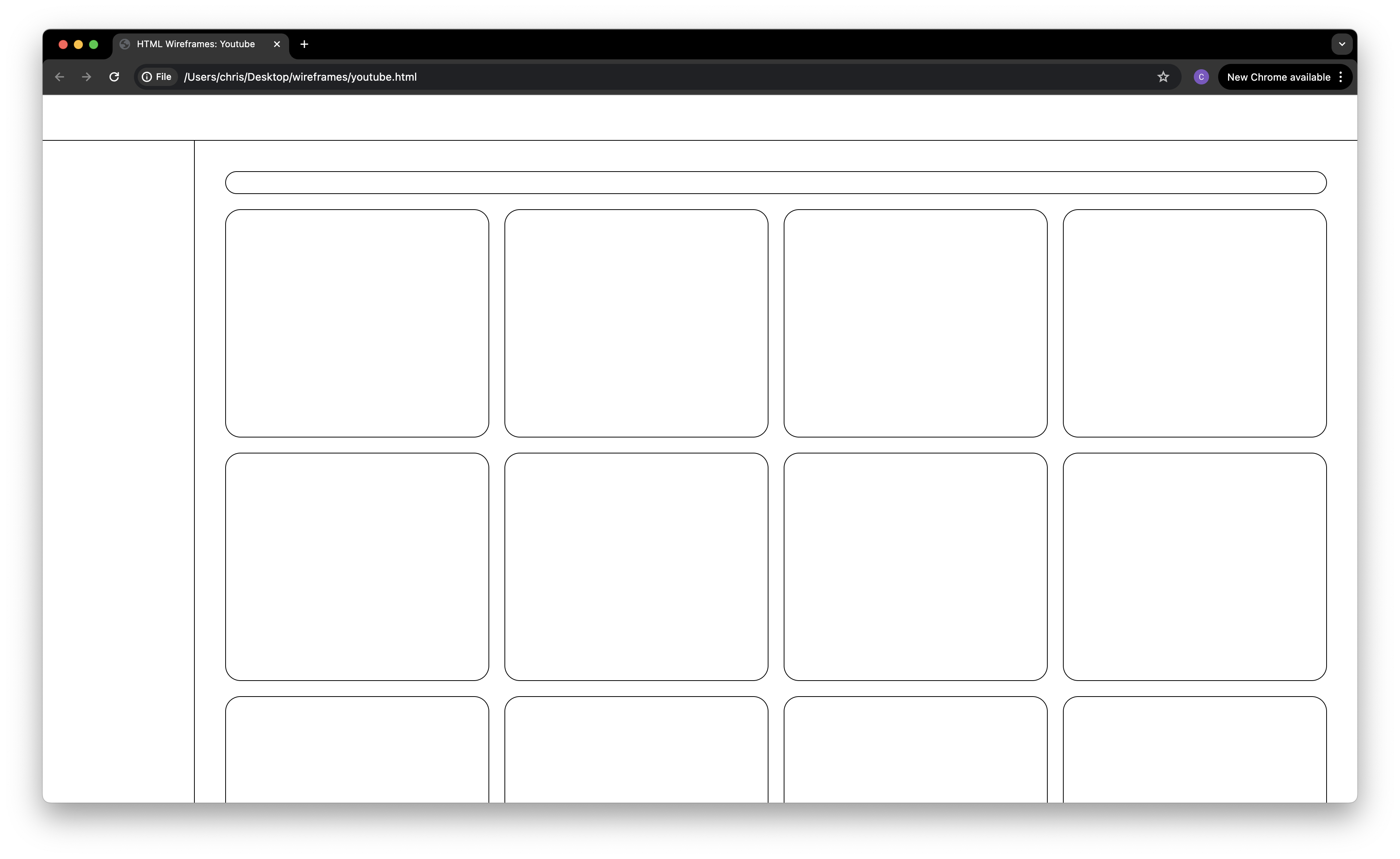
- Sample HTML wireframes
- How to Center Anything with CSS - Align a Div, Text, and More, by freeCodeCamp
- Position
- Flexbox
- CSS Grid
- 이번에야말로 CSS Grid를 익혀보자
- HTML Elements: