P1 Personal Utility (blurry sensation)
In our everyday lives, utilities (유틸리티) refer to the essential services and infrastructure that underpin our activities. This may range from services such as water, electricity, natural gas, transportation, and waste management. Or to infrastructure such as roads, bridges, parks, and telecommunications systems. If we expand this to the digital space, we may think of utilities as the infrastructure of our computers – such as a web-browser, messenger application, maps, camera, calculator, or note-taking application.
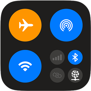
Utilities on an iPhone, including Airplane Mode
If you go into the App store on your phone, you'll likely find an "utilities" category. Similarly on your desktop computer, there's likely already a "Utilities" folder which contains things like your Bluetooth application, or other applications necesarry to the functioning of our computers. One other way to identify a utility, if it's not labled as such, are those applications made by hardware developers such as Apple. If these applications weren't preinstalled on your phone, tablet, or computer, perhaps it may not function to our basic expectations. In the example of Apple these applications used to include a web-browser (Safari), note-taking app (notes), music player (iTunes/Music), and other truly essential applications. Over time however, Apple has broadened their scope to include products such as News, and drawing applications.

Apps made by Meta
There are many reasons this expansion of the perception of what a digital "utility" entails. However, one reason may be found in the longstanding debate around how we should perceive the popular internet-based products that mediate our lives. Mark Zuckerberg famously described Facebook as a utility rather than a social network. Should we then also think about Instagram in this way as well?
Flight Simulator, by Laurel Schwulst and Soft
With the adoption of digital technologies, it's also interesting to consider their form and foundational premises. In the early days of the personal computer, and the invention of the "windows" graphic user interface (GUI) the desktop metaphor re-imagiined the office desk in a digital space. With the introduction of iOS and the iPhone, skeumorphism – "a derivative object that retains ornamental design cues (attributes) from structures that were necessary in the original"1 – was a design tactic used to ease people used to "real" objects into digital interactions. If sensations which previously involved complex textures, smells, and tastes, are being made completely digital and mediated by glass, are we experiencing a loss or blurring of the senses?
Original Notes App icon, IOS, 2007
While the tensions between utility and luxury (or frivolity?) are apparent in social media, how do we consider the functional apps we use everyday? Does Google/Kakao/Naver maps tracking and analyzing our movement to improve their products complicate the traditional understanding of a map as simply a navigation tool? Should we be compensated for using our apps instead of paying for them? Especially in the age of generative AIs, when it seems all of our public (and private) data, as well as most copyrighted creative works, have been used as training data without our consent.
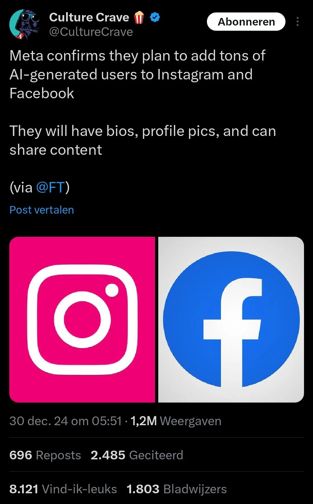
In early 2025 Meta announced it would begin adding AI users to their platforms
Furthermore, how do the profit motives of the companies behind these tools comprimise or manipulate our experiences? How do notions of scale, accessibility, and mass appeal, which undoubtedly offer benefits in many ways, create products that are generic or otherwise impersonal? As applications introduce products and features no one has asked for (sometimes to embarassing results), and the "enshitification" of the internet expands, should we be looking for alternative utilities that serve our needs better?
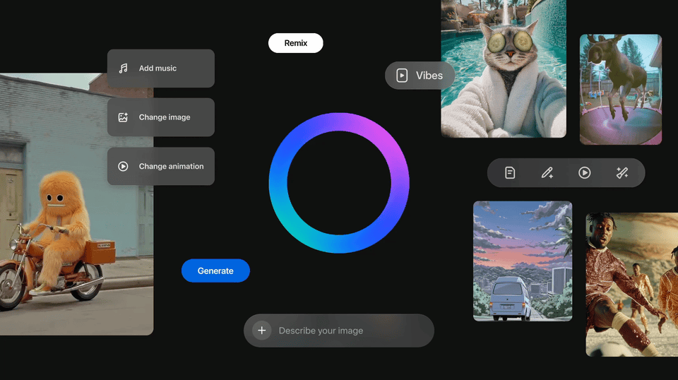
Meta "Vibes" synthetic media social network
In this project we will explore what we consider digital "utilities", and how freed from practical constraints, we can make them more personal. To do this we will architect, design, and prototype a "Personal Utility" that is based on your own interest, experience, and/or goals.
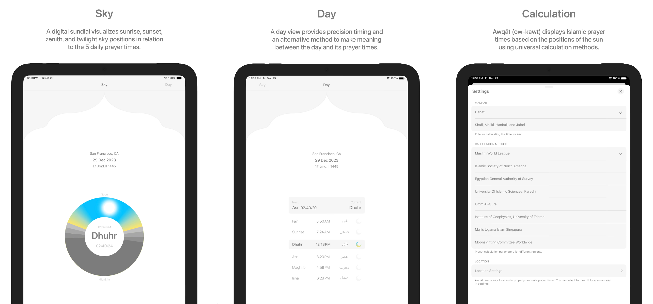
Screenshots of Awqāt, "The most beautiful Islamic prayer time app on the app store", by CamlCorp/Omar Mohammad
The outcomes are open-ended – and could range from a messenger service, to recipe website, weather application. And can be designed for any screen – from a phone, to website, to smartwatch, to digital picture frame. However, the application proposal needs to be specific and unique, and should address something fundamental like a utility.
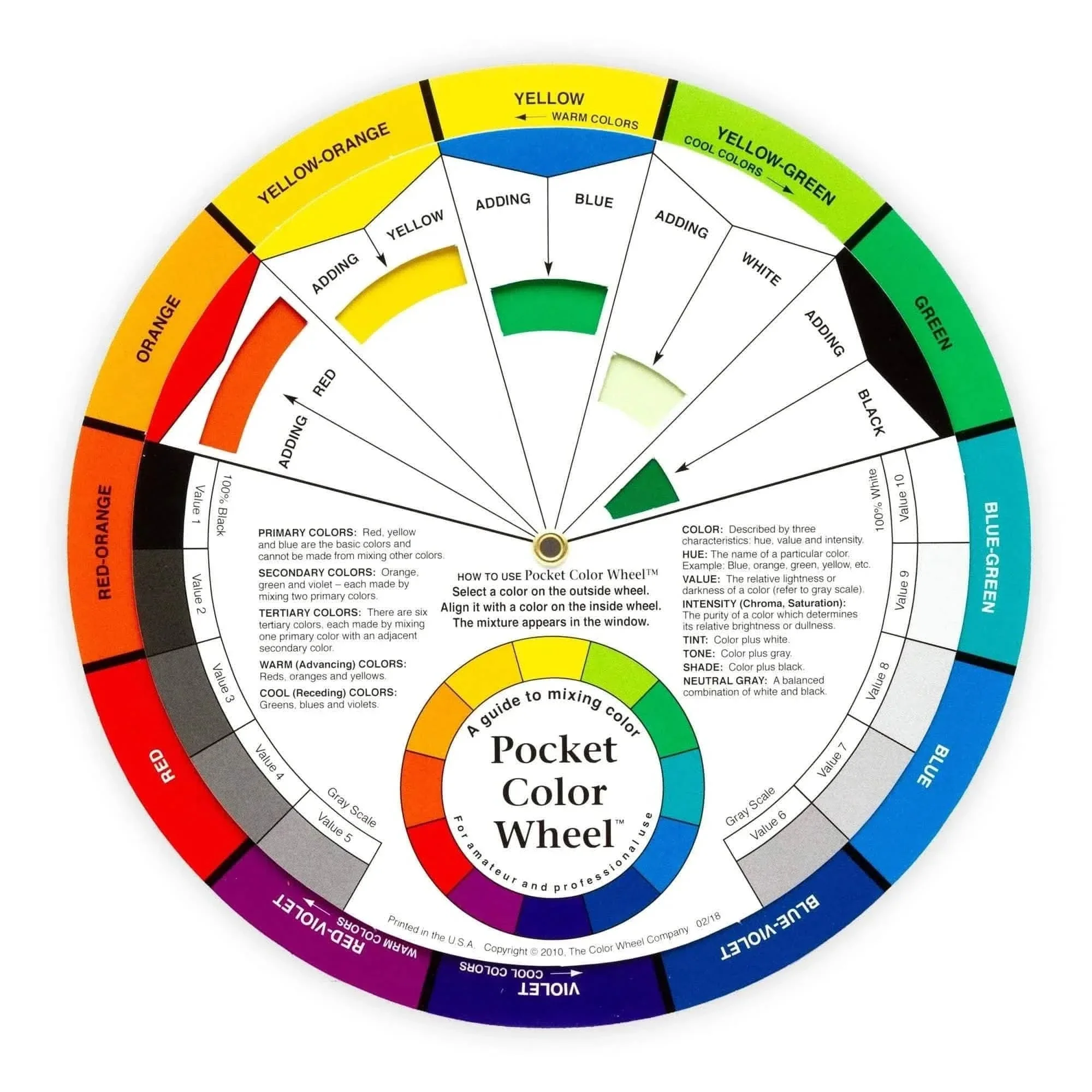
Colorwheel
Synesthesia
Synesthesia is the process of blurring of the senses. Those with synesthesia will often describe "seeing" colors while listening to music. Or a sensation of taste when looking at a painting. Many artists and designers evoke a certain feeling of synesthesia – explicitly or implicitly. Writer Amy Silmman describes how institutional art education, and our models and inspirations may instill a color-logic into other senses or forms. In her essay "DRUG, POISON, REMEDY, TALISMAN, COSMETIC, INTOXICANT " she writes: "From Wassily, we picked up crypto-informational tips that boiled down to a kind of color astrology, an optimistic speculation system in which blue is cold, that red is a square, and that green is a feeling".
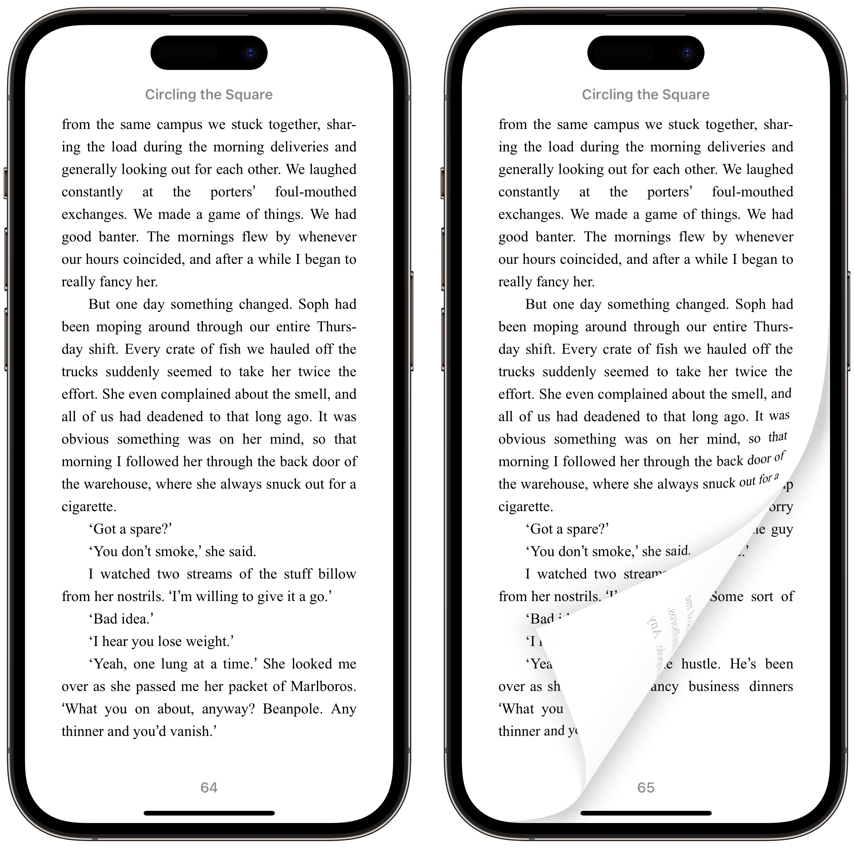
Apple Books "classic" page turn animation
In a very different way, digital applications encourage us to repress certain senses, and values others. When using our phones, vision and sound are most prioritized, with touch being reduced to swipes, pinches, and taps on a smooth glass surface (and smell and taste not being engaged with at all) – surely some blurring of the senses occurs in this process.
Regardless of whether or not synesthia is learned or natural (or both), consider how we may transfer, supress, and exxagerat our senses in the digital medium as you work on your personal utility.
Learning Outcomes
- Use storytelling to explain a complex idea in a few screens
- Learn basic UI Design Principles
- Become familiar with prototyping software
- Develop an understanding of and implement a site architecture
- Design with interaction, time, and usability in mind
- Expand our views on the idea of "utility" and what makes an app "functional"
Requirements
Proposal for a personal utility made up of:
- Written description describing what your utility is
- Site architecture visualizing the various screens in your app (can be a desktop, phone, watch or other screen-based app)
- Static compositions visually representing the entire application – you don't need to show all states of all pages, but just give a sense of the application overall
- One prototype demonstrating the interactivity of one action (minimum 3 screens) built in prototyping software (Figma, Framer, Protopie, or Keynote recommended)
Shrub, by Linked by Air
Project
Project Kickoff: Tues Mar 3
Discuss project brief
Step 1: Due Tues Mar 10
What are digital utilities you use everyday? What about every hour? Consider their pros and cons, limitations and potential, and create 3 proposals for alternative personal utilities you would like to use.
If you were to design your own weather app, would you also like to see how the weather has behaved historically on the same day over the past decade? Do you want to make a timer with presets for the various types of tea you brew regularly? Does your music player have too many options and you miss the experience of an Ipod Shuffle?
Your proposals should include sample imagery you collect describing your idea, and help us imagine how the project may take shape formatted as screens/slides in Figma or Google Slides.
Step 2: Due Tues Mar 17
Choose a concept and create a site architecture, and example user experience flowchart. Based on these artifacts, create wireframe sketches of 3 representative screens, describing your utility.
Your wireframe sketches should be simple enough not to distract us from their proposed interaction, but visually descriptive enough for us to imagine how it may take form in a final design. I would suggest you make these in Figma.
Step 3: Due Tues Mar 24
Refine your wireframes into high-fidelity design using Figma. Your designs should have a visual identity, "interaction model", and "design system" at the their core. Create 2 visual directions and add simple interactions to them in Figma.
Step 4: Final Crit Tues April 21
Select one visual and interaction direction and refine your prototype using Figma/Keynote/Rive/After Effects/etc. developing one full interaction across a minimum of 3 screens.
Share your final utility concept, sitemap, static design and prototype with the class in a presentation format (I'd suggest screen recording your prototype to present, as well as sharing a link where we can interact with it).
Calendar
Week 1
Project kickoff

Week 2
Concepts
Step 1 Due

Week 3
Site Map
Step 2 Due

Week 4
Comps + Rough Prototype
Step 3 Due

Week 5
Fine Tune Designs and Interactions

Week 6
Field trip to AG Lab

Week 7
Finalize Prototypes and presentation

Week 8
Step 4 Due / Final Crit
Seungmee Lee Guest Lecture
Resources
References
- Brick
- Bug by Linked by Air
- Shrub by Linked by Air
- Behind The Paywall by Matt Visco
- We Plug by Matt Visco, Taishi Kamiya, Bora Kim, and Arvind Sanjeev
- Unread Cats by Matt Visco
- Death Imitates Language by Harm van den Dorpel
- Flight Simulator by Laurel Schwulst and Soft
- Image Scrubber by Everest Pipkin
- Glaze from UChicago led by professors Ben Zhao and Heather Zheng
- Ipad works by David Hockney
- Instagram Demetricator by Ben Grosser
- Jules by O-R-G
- Multi by O-R-G
- Wyoscan by O-R-G
- Awqāt by Omar Mohammad / CamlCorp
- Prayer Place by Omar Mohammad
- Timer by Omar Mohammad
- Somebody by Miranda July
- The Space Between Us by David Horvitz
- unusual.app by Ennio Dybeli
- Dandelion Clock by Shaheer Tarar
- Nearby Glasses by my PocketPC GmbH